BlueJeans Desktop App Manual Refresh Feature.
BlueJeans goal is to make video conferencing as easy and pervasive as audio communications and create visual experiences that people love. During this sprint we were solving for an intuitive, accessible way to manually refresh the upcoming meetings list.
Role
UX researcher
Visual Design
User Experience
Deliverables
Platforms
Mac Os
Window
Date
June 2022

Problem Statement
“Currently the app refreshes the list of upcoming meetings only on app launch and in intervals of 15 minutes. However if a user’s calendar is active and keeps changing, it is not intuitive for the user to restart the app to get it updated.”
Competitive Analysis
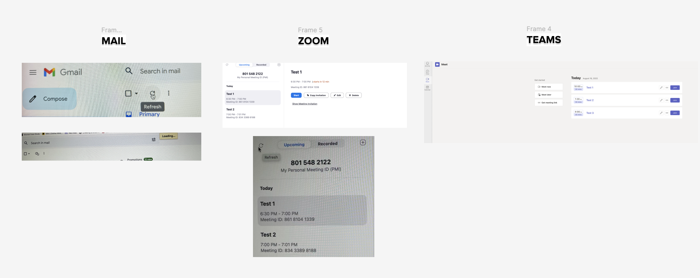
As a first step to ideate a solution I did a thorough analysis of our direct and indirect competitors and their use of a refresh button or refresh feature.
Findings
Gmail and Zoom Desktop App:
Utilize a refresh button for quick list refresh.
Indirect Competitors (Facebook, LinkedIn, Instagram):
Refresh feed by pressing home button or logo.
Questions to Consider:
Is a loading animation necessary?
Do we need a timestamp?
Explorations
Refresh by clicking the upcoming meetings button:
Based on my findings for the refresh behavior in apps like Facebook and Instagram I approached a design where the user could refresh the list by clicking the upcoming meeting button.
The Problem with this approach: It’s not intuitive for the user to glance at the design at fist sight and know that they have to click on upcoming meetings to refresh their list.
Refresh by clicking an Icon.
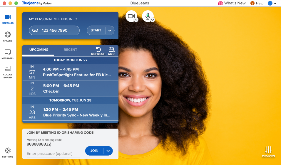
A second approach was to add an icon that was intuitive, based on the competitive analysis a curved arrow was the best choice for the icon. I also added the text “Refresh and Add” for accessibility purposes.
The Problem with this approach: Discussing this approach brought up questions such as.
What happens when the user clicks the refresh button over and over again?
How will the user know that a new meeting was added to the list?
How will the user know that the list has been refreshed?
Iteration and Current Design
Developer Handoff
Based on the feedback of my design team along with the developers we decided that the best approach would be to add a refresh icon along with a tooltip that lets the user know what the functionality of the button is as well as the timestamp for last updated. I also highlighted any new meetings that showed up on the list.
One of the most important steps in my design process is assuring that the design document has all the details and digital assets required for the development team to bring the product to life. Which is why I like to provide a detailed flow with a clear explanation of all the specs in each of my deliverables.
Attention to minimal details
Design Quality Assessment at BlueJeans
One of the final and critical steps in my process is the Design Quality Assessment. At BlueJeans, I used Jira to create tickets, meticulously reviewing new builds to ensure they align with the design I submitted.
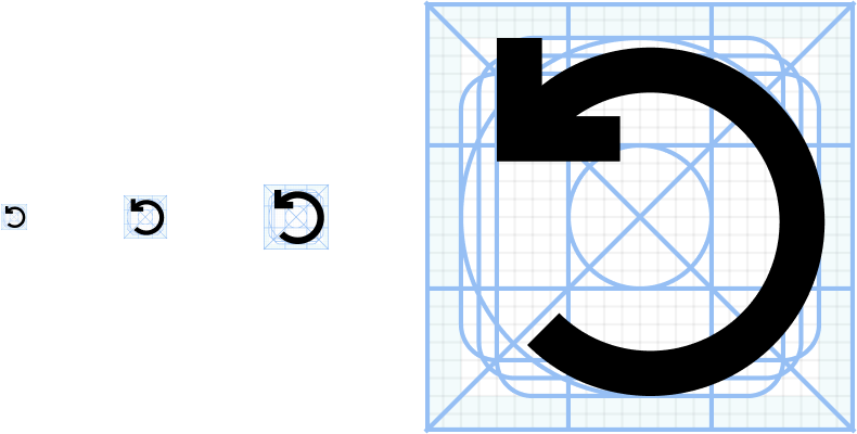
In one instance, I noticed a discrepancy in icon sizes. The refresh icon was slightly larger than the add meeting icon. Upon further investigation, we discovered inconsistencies in our icon library within our design system. Despite all icons being the same 24px by 24px size, they had varying internal padding.
This discovery led to a comprehensive reorganization and standardization of our Icon library, guided by the principles shown above.
The Outcome
As a result of the current design implementation users manually refreshed their meeting list 10k+ times. This reduced considerable customer support calls along the lines of not seeing their meeting in the upcoming list.
What I learned
Eye for Detail
Every pixel, padding, border, frame counts when designing for a desktop app. One can never be too meticulous when it comes to making sure everything is aligned perfectly.
No Design is Ever “Done”
While the manual refresh is now being implemented in the desktop app. I don’t consider it to be done. Some improvements might be to highlight the icons on hover mode to improve accessibility.
When in Doubt Always base it on the Data
Research plays a fundamental role in UX for a distinct purpose. Whether it involves user testing, a card sort, or a comprehensive competitive analysis, the bedrock of consistently anchoring your design decisions in research is essential when communicating within cross-functional teams, including fellow UX professionals, Product Managers, and Developers. It not only validates the design but also offers valuable insights.


