


BlueJeans Desktop App Government Sign In.
During this sprint we were solving for an intuitive, accessible way for government entities to sign in through a Preference / Setting.
Role
UX researcher
Visual Design
User Experience
Deliverables
Platforms
Mac Os
Windows
Timeframe
4.5 weeks
June 2022 - July 2022

Problem Statement
“How might we make the sign in process for government users simple and intuitive?”
Navigating Multiple Stake Holders
“GSAM” – is a Verizon standard that stands for Global Sensitive Accounts Management. Given that GSAM was a feature implemented all across the board; mobile Ios and Android, web, and desktop app. When I met with some of the stakeholders an immense amount of research and implementation had already happened on mobile and web thus the direction was somewhat “clear” as to what was needed from design for the desktop app.
A “Simple” Solution
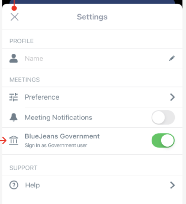
I was given directions to create a similar sign in experience as the one already created for mobile in order to keep consistency across the board. A settings button for the user to click and select government sign in. The choice to add a visual icon for users to change the log in option was made due to the fact that the amount of government users were a very small group of people. Therefore, the option to sign in as a government user needed to be concealed from our regular users in order to prevent unwanted sign ins or clicks.
Explorations
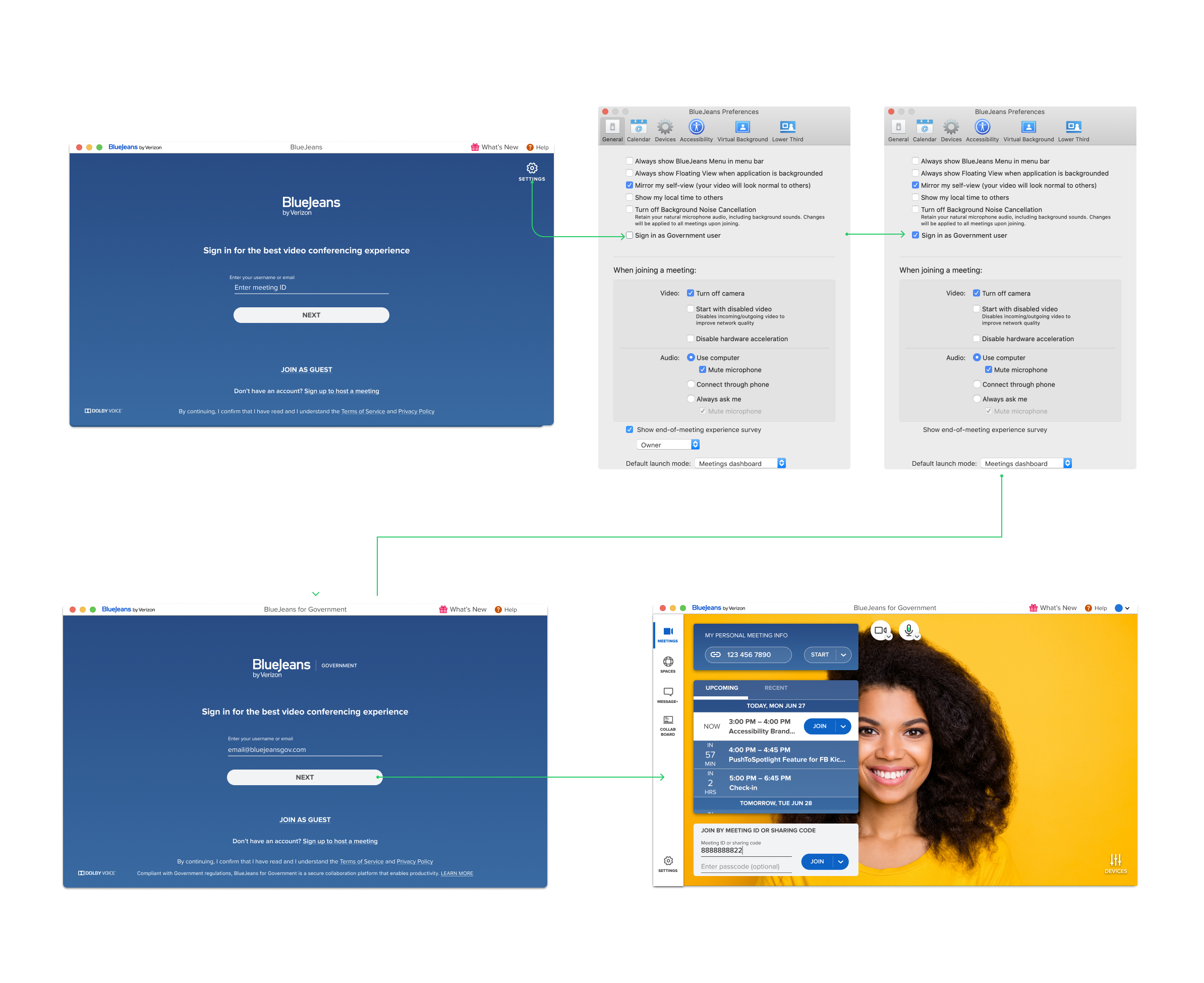
Designing for a desktop app is kind of like designing a “house of cards” a slight change or add on might throw the whole screen off. Every pixel needs to be precisely in place, because there is an existing intricate system in place already that has been proven to work for the users.
Why it didn’t work: While this is exactly what was asked for I knew this specific approach wouldn’t work on many levels.
Adding yet another entry point to settings seemed unnecessary, our users already know of two other entry points to manage settings. One being the main menu and the other one being in meeting option.
How would the government user know to click on settings to activate GSAM log in?
If a user wanted to switch between government and regular sign in they would have to sign out of their account and go through the process all over again.
From accessibility and usability standpoint this particular design approach would provide a poor user experience.
Usability Testing
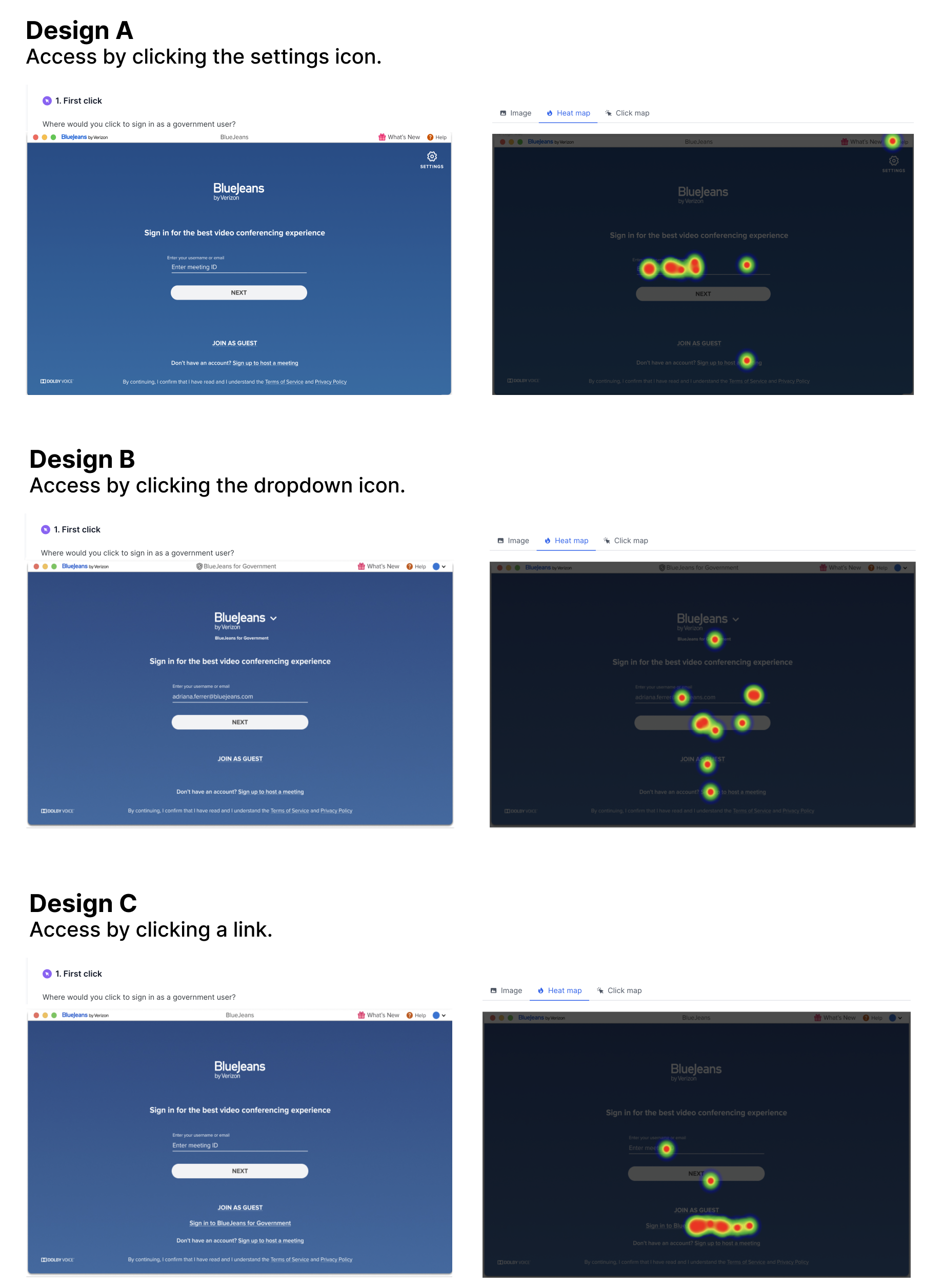
When working with a large group of people such as product management, engineering, and business stakeholders it’s easy to be pulled in different directions. Everyone has personal opinions or thoughts on what the design should be. In oder to for me to make the right decision and back it up with concrete data I ran some usability testing on three different designs.
Too obvious
At first glance it seems like Design C would be the obvious choice but how obvious is too obvious? Yes the heat map and click map show best results with Design C but when we think about the original scope one of the requirements was for the option to be somewhat obscured. If I went with this choice, the link could could lead our regular users that are curious to dabble with it.
Just Enough Research
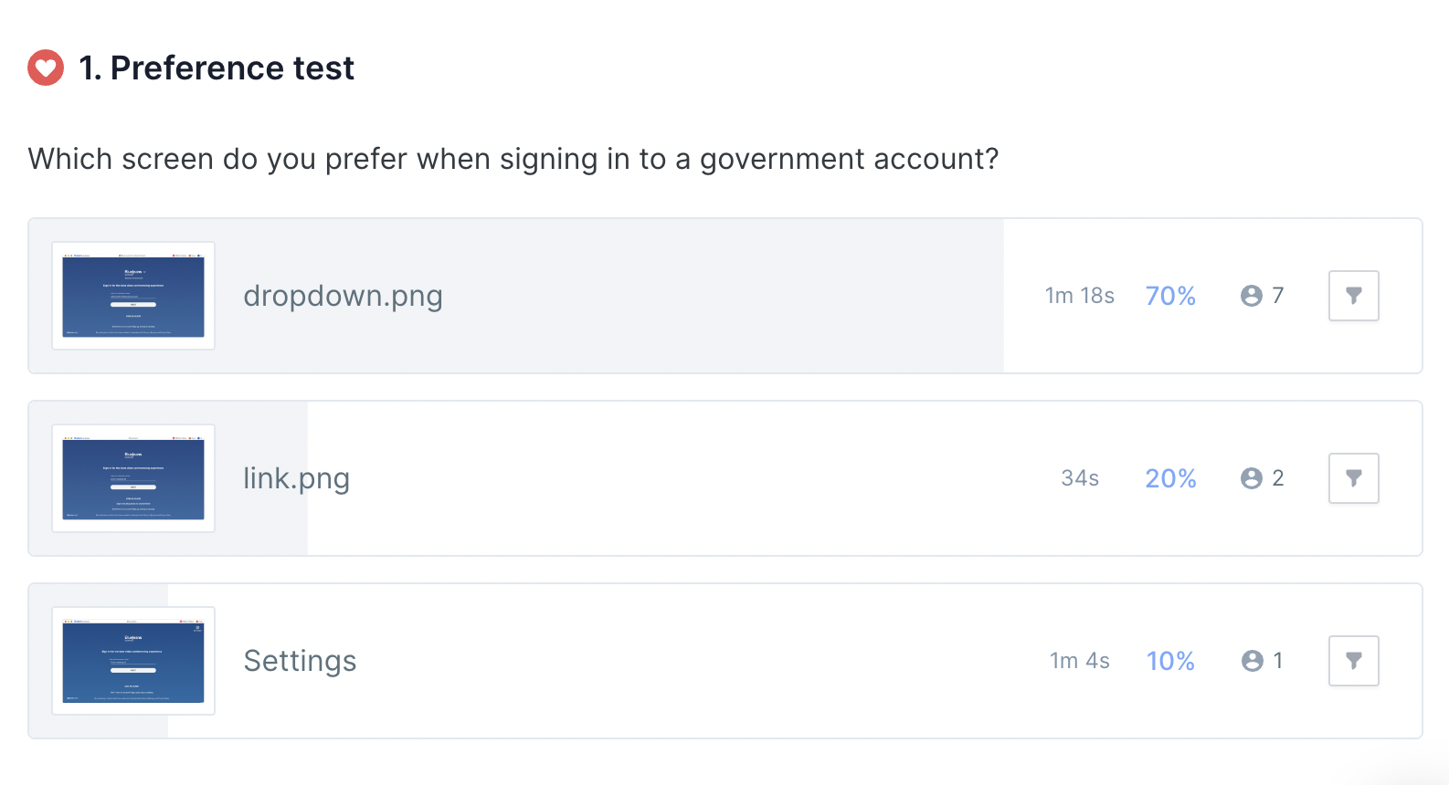
I ran one more test to confirm what I knew was the best option. The results show that the best option visually, and from an accessible point of view would be Design B. Using a dropdown icon was just the right formula of what was needed.
Final Design
The final design for the BlueJeans desktop app government sign in was a success, where 89% of users are able to log in without confusion. The dropdown icon that was implemented led to successful logins by most of government users. Based on best practices, research and usability testing, this design was able to provide a solution to keep the sign in setting for a selected group of government users obscured to not confuse the majority of users but accessible at the same time. This current build is being used as a demo for government agencies.
What I learned
Fail, and fail early, and fail often.
The failed approaches ultimately led to the best design possible. Sometimes as a designer it’s scary to design something thats considered a failure. I welcome failure and take is as a guide in the right direction.
Managing Multiple Stakeholders
It can get chaotic sometimes with so many people involved in the same project. I learned that as I designer I have the tools to speak my mind.
When in Doubt Always base it on the Data
Research exists in UX for a reason. Whether it be user testing, a card sort, or a competitive analysis. Always basing your design choices on research is key when presenting in cross functional teams such as other Ux teammates, Pms, and Devs. It validates the design.